slaid
Well-known member
- Joined
- Jul 6, 2024
- Messages
- 85
- Reaction score
- 544
- Location
- United States, Texas
- Website
- mechalove.me
- Gold
- 67,834


- Pronouns
- he/him
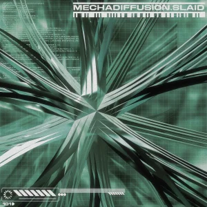
very amateur to these aesthetics and wanted to do them a bit of justice, but I'm working on some limited knowledge :)! any feedback is appreciated!!
i tried to go for an early 2000's vibe with some of them, but also wanted to go a vibrant and more modernist feel on others.
made in cinema4d, illustrator, and photoshop.
i tried to go for an early 2000's vibe with some of them, but also wanted to go a vibrant and more modernist feel on others.
made in cinema4d, illustrator, and photoshop.