All good points!
My interpretation was kind of through the lens of tech-pessimism, where a lot of things are being kinda created from mediocrity machines or simulacra. I'm quite attached to Inter and Inter Tight as typefaces and have gotten some eh responses from said friend for using it due to the immersion in the digital. They did follow this up with asking if the font in use was Helvetica or closer to Myriad Pro (It's Metropolis Extra Light :3), playing directly into the following:
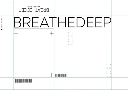
Helvetica's arguably the most recognizable & popular Sans Serif typeface in the world & was designed entirely pre-digital, yet all the same it's what I consider the clean, modern, digital type...
...Additionally interesting to me is that there is a style of type that I look at and go "aha! not real!" and it's some type designs that I would go as fall as calling "neo-serif" in a sense. They're incredibly fancy type displays that usually are presented with a retro flair that's accurate to memory alone.
I definitely agree with this. I think Helvetica's fine to use especially due to that pre-digital context. You could argue it lacks identity *because* of that degree of use, but I think it's a perfect blank slate. To your point,
@Andrew , when seeking fonts it admittedly feels kinda like I have to do a lot of combing when searching for type platforms. I don't think the 'neo-serif' fonts as described are necessarily bad either. I *do* really want to play with this more and seeing what the friend thinks of it when actually put into the abstract design environment.
I honestly think that, serif or sans, it really depends on what you need the font to achieve in the end. Personally I don't see sans serif fonts as "lacking tangibility"; far from it, in fact, because I absolutely see lots of real signage and contexts sans serif fonts work better to convey Vibes (using vibes very loosely here) than serif fonts.
Precisely,
@Transendium !
maybe I don't really anthropomorphise fonts as "tangible" or "real" as much as your friend does
I'm starting to think it's a flavor of burnout on digital design, which, fair. I'll have to ask and check up on them.
I think the "real" factor for me often comes in the form of typeface choice inside of a category. Like Times New Roman has been so overused when it became the default serif font for most word-processors in the 90s, so now it feels a bit lowbrow and noisy.
...
Similarly the font Impact was destroyed when it became the top text/bottom text meme font throughout the 2010s so now I can't take anything else in impact seriously.
Genuinely. Seeing Impact in cyber and meatspace kinda gives me this weird backlash effect everytime I see it now. It's a fine font but I can't undo the internet brainpoison inflicted upon me 🤷♀️
But now we're using digital tools and can actually use the original intended design - Neue Haas Grotesk. It's a wonderful font that to me reads like Helvetica but just adding on a level of attention to composition.
If I found it correctly, it's a wonderful implementation and I might give this a bit of a shake, depending on what the licensing is like. Thanks for bringing it to my attention
@ethos ! :D