kmart's commercials

kevin supermarket

Well-known member
Joined
May 3, 2024
Messages
256
Reaction score
1,497
Age
21
Location
kevin's supermarket
Website
kevinsupermarket.neocities.org
Gold
5,237
Glowing Username (Anniversary)
Verified Checkmark
Gentle Dreams
Subgroup
Blurb Style Contest - Participant
Pronouns
she/they
(also known as the km-art thread)

ever since i joined this forum, i'd joked about wanting to start an art thread at some point but knowing very well i don't make art consistently enough to warrant that. i'd like to start making a change. i have things i can draw, and it's about high time i start kicking my ass into high gear, even if the gear in question is just a knob going from 1/10 to 2/10. i'll probably be posting a lot of CHIMERA here, just because it's the most prevalent thing on my mind (and it's a fucking crime i haven't drawn way more of her already)


sketch stuff 1
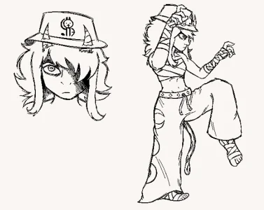
1763538411650.webp
 
(cough, cough)
yall fw web design at all

1768433476464.webp

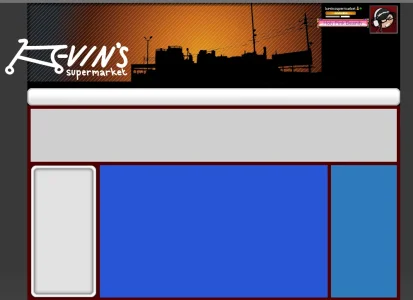
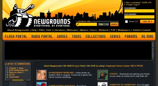
currently goofing around with a new mockup for our website. trying to lean big into the vibe of late 2000s-early 2010s flash websites. problem is... we're kinda stoopid, and have never really taken this sort of thing seriously before. we're pretty aimless in this regard! you can likely see where our attempts at imitating this design language shows (and studying Newgrounds' website from 2006 is carrying this atm), but we're still struggling to feel as though we're really making something... unique? cohesive?

1768433847131.webp
1768433872647.webp
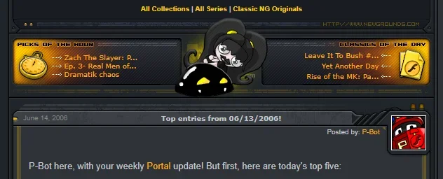
(the aforementioned Newgrounds 2006 website)

part of that struggle comes from the lack of overall identity kevin's supermarket has. it has always meant to be a place for us to start our "flash game arcade" (modern: HTML5 browser game stash) whilst having the face of something well-known and well-loved from the past. however, since it's been So Long now since that golden era, memory just doesn't serve us all that well, and we're struggling to give this a specific look that feels like it BELONGS to us.

1768433932055.webp
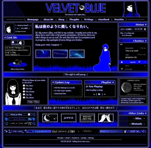
(velvetblue.neocities.org)

the above example of Velvet Blue's website is also a major point of inspiration for us in terms of organizing content and what's actually worth putting ON a website. note that despite kevin's supermarket intending to be a modern flash arcade, we don't actually have shit to show off in that regard (lol). this is meant to be tailored in the direction of "this is just a personal website for now, but Later On, this is what it COULD be". if anyone understands what the hell we're rambling about and happens to be more knowledgeable about this sort of thing, then by all means, provide us with some insight! what kind of elements should we consider incorporating into this design to really get the feel across? what's worth taking from the examples above and reworking into something more unique to our design? we are very stupid. thank you
 
Back
Top