chunkofwax
Well-known member
- Joined
- May 17, 2024
- Messages
- 153
- Reaction score
- 1,105
- Age
- 22
- Location
- wax zone
- Website
- chunkofwax.com
- Gold
- 69,939
hello :)
I recently made a little profile post about how I was starting to learn HTML and CSS to redesign my current website. Thought I'd make little deskgen-exclusive updates here while I poke away at it, and also take it as an opportunity to talk about the site as it is rn and what my intentions are. I was gonna make this apart of my art thread, but I thought it was better as it's own little thing :)
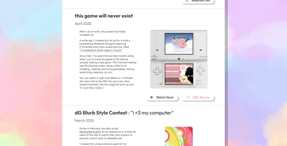
the current chunkofwax.com
When I first made my site around a little over a year ago, I had a few objectives in mind. Namely, I wanted to:
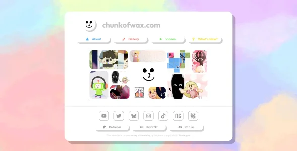
chunkofwax.com as it exists rn
the problems
As it is right now, the site is fine. But I can't help but feel a little dissatisfied with some parts of it:
the solution!
Recently, I found out about nekoweb.org! Essentially, it's an alternative to Neocities, but you can do more with it. But more importantly...! It's cheaper. $3/month cheaper, in fact. And I've done the math, 3 is less than 4, so I'm pretty confident that I can probably afford it. Taking into account the cost of the domain too.
The only real hurdle to switching from Carrd to Nekoweb is having to learn HTML and CSS and all that fun stuff. But as far I'm concerned though, that's just a learnable skill like any other. All it would take is just some time investment. So I got to work :)
the goals
With this new version of my site (v2? Technically v3?), I have a few goals in mind:
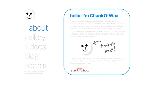
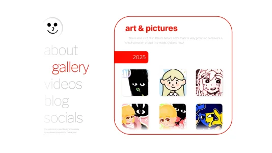
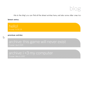
Here is a concept I whipped up in photoshop the other day, prior to actually starting on the site. I don't actually have an idea for what anything other than the homepage would look like, but we'll cross that bridge when we get there. For now, I'm starting with this just to establish the look and feel.
It's all subject to change, of course! There's already some stuff that I'm thinking about changing, but I'll address it later. I'm aiming to keep it a little bit more minimalist in contrast to what I had before, but so far, I think I like it.
the now!
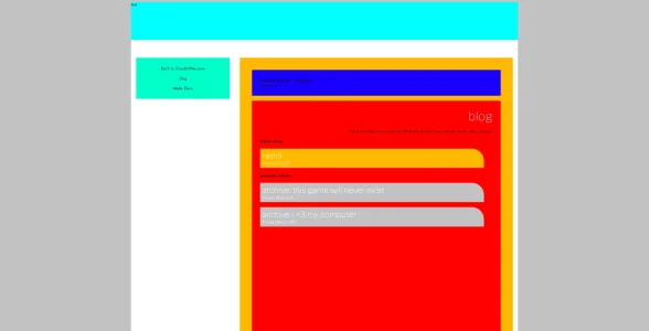
I'm happy to say that I actually do have a little bit of the site working right now! Mostly just everything that's on the left site of the home page.
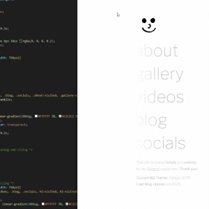
I'm pleased with the progress I've made so far. I spent a few days learning the raw basics of HTML, and once I figured I knew enough, I got started on this and just googled what I wanted to know as I went along. So this was just made with just plain ol' HTML and CSS. No additional libraries or tools or what have you. And I'm gonna try to aim to make the rest of the site purely HTML and CSS too.
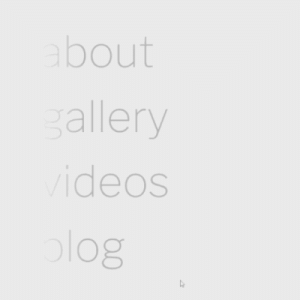
Idk if this GIF really captures it well, but I'm happy with how smooth it is currently. I was worried that animating some of the stuff would make it feel less responsive, but it works great. I'm especially a fan of how the little hole-punch bit with my pfp worked out. Figuring out how to get that shadow to appear was a bit of a puzzle, but I figured it out. That will be the button that returns you to the home page, so I find that it adds a nice little tactile feel.
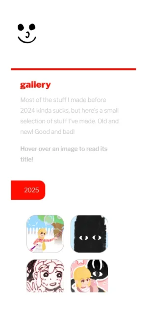
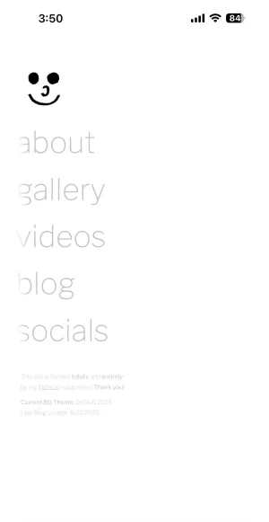
i also begrudgingly coded it so that it looks acceptable on mobile
the future...
I will try to continue to work on this site and provide updates in the future. I will probably be pretty busy in the coming weeks, so idk how much more time I can dedicate. But, I've been having fun working on it. To be honest though, even though I love it, working on illustrations and stuff can be a little taxing and tiring. Especially given my process (doing the boiled-lines stuff and making almost every illustration an animated GIF takes a toll on one's soul). So it's fun to work on something else that has a fun, problem solving element to it that isn't quite as tedious
okay that's it now, thank you reading this very long write up, updates to come later bye bye :))
I recently made a little profile post about how I was starting to learn HTML and CSS to redesign my current website. Thought I'd make little deskgen-exclusive updates here while I poke away at it, and also take it as an opportunity to talk about the site as it is rn and what my intentions are. I was gonna make this apart of my art thread, but I thought it was better as it's own little thing :)
the current chunkofwax.com
When I first made my site around a little over a year ago, I had a few objectives in mind. Namely, I wanted to:
- Flaunt the chunkofwax.com domain
- Partly for aesthetic reasons lol. It feels cool to have a nice clean url like that. But secondly, it's really important to me that I have a place that's immediately recognizably as being mine.
- Have my own little corner of the web
- I made a website to begin with because having all my online presence be dependent on social media does not sit well with me. I do everything I can to make my user-experience on Twitter bearable, but it's still Twitter. I can't post a video or GIF on Bluesky without it being compressed to shit. Every video on Instagram has to be a reel. YouTube is tolerable. I didn't have access to my TikTok account for a little bit cause the site was banned nationwide (!?). It's all kinda bullshit and I'm losing the desire to engage with it more and more, so putting distance between myself and it would be nice.
- If, for whatever reason, anything goes kaput, it gives me a lot of confidence to know that all you have to do is google my username to see what I'm up to. Tbf, 99% of people on the internet largely treat the work they see as dispensable, so I don't think many people would care to look for me if I ever gave up any of these sites. But at least the option is there!
- Use only Patreon funds to fund the site
- I have two very gracious personal friends of mine who pay $3/month for my sparsely updated Patreon. After Patreon takes a cut, this leaves me with a little over $4/month to spend on the site. It's not a very big budget, but it's important to me that I only use the money I make from my work to fund this. It's just a nice little personal satisfaction thing.

chunkofwax.com as it exists rn
the problems
As it is right now, the site is fine. But I can't help but feel a little dissatisfied with some parts of it:
- It's a Carrd site
- Most issues stem from this fact
- When first making this site, I was looking at a few options. I looked at Neocities, of course. But learning HTML sounded too daunting at first, and given that I wanted to use a custom domain, $5 a month to become a Neocities Supporter was too big for my $4.72/month budget (lol). So, I eventually decided on Carrd. It would enable me to easily make a site without having to learn much, and it also fit in my budget. The cheapest plan for Carrd that allows for custom domains is $19/year. That, plus the yearly cost of the domain, fit nicely within my cheap, baby budget.
- It's laggy
- By virtue of it being a whole ass site made in Carrd, it's a bit laggy. But, I also made the decision to dress it up with a lot of moving stuff and animations, which makes matters worse. You're limited with what you can make a Carrd site look like, so imo, a lot of Carrd sites look kinda samey and impersonal. Dressing it up with an animated background and animated buttons, etc. etc. is my way of trying to counteract that. But it has an unfortunate side affect.
- Layout is a bit odd
- Lacking a stronger personal touch
- Looks like piss on mobile
- I've tried my best to make it look better on mobile but I've given up
the solution!
Recently, I found out about nekoweb.org! Essentially, it's an alternative to Neocities, but you can do more with it. But more importantly...! It's cheaper. $3/month cheaper, in fact. And I've done the math, 3 is less than 4, so I'm pretty confident that I can probably afford it. Taking into account the cost of the domain too.
The only real hurdle to switching from Carrd to Nekoweb is having to learn HTML and CSS and all that fun stuff. But as far I'm concerned though, that's just a learnable skill like any other. All it would take is just some time investment. So I got to work :)
the goals
With this new version of my site (v2? Technically v3?), I have a few goals in mind:
- Make something that runs fast and looks good (or at least looks better than before)
- After looking at a bunch of sites belonging to users of this very forum, and also perusing old wayback machine archives (shout out webdesignmuseum.org), I've grown to appreciate visual appealing and efficient web design. Striking the balance between both things feels rare nowadays! I want to try and emulate that, at least a little bit. Some of y'all have really cool sites, I wanna get in on that :)
- Make something that feels more "me"
- Idk what this exactly means tbh, but I think as long as I have a hand in making it myself, that's good enough I guess.
- Add a blog section?
- I don't like posting my thoughts publicly all the time cause it feels like I'm imposing my bullshit onto people when it comes up in their feed. But, if it's a blog, it's fair game. You're going out of your way to read my thoughts, I can say whatever the hell I want!
- Make something that works better on mobile
- Designing for mobile makes me want to throw up, cry, and throw rocks at my computer monitor, but even if it isn't perfect or totally efficient, I think designing something that at least demonstrates some intention for the average mobile user would be good.
- Open the door for z&c.com
- In other words, make a site for my characters. (I would be a different domain though, of course. You can't have ampersands in your domain name, unfortunately)
- This is more of a long term goal though. Once I can my own site, I think I'll be able to take a crack at that. It's been stewing in my brain for a little while though, and I think it could be super cool. It would take inspiration from websites that I pursued during my childhood, I have some fun ideas :)
- Keeping this under wraps for now though, don't want to spoil too much of the fun
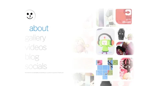
Here is a concept I whipped up in photoshop the other day, prior to actually starting on the site. I don't actually have an idea for what anything other than the homepage would look like, but we'll cross that bridge when we get there. For now, I'm starting with this just to establish the look and feel.

It's all subject to change, of course! There's already some stuff that I'm thinking about changing, but I'll address it later. I'm aiming to keep it a little bit more minimalist in contrast to what I had before, but so far, I think I like it.
the now!
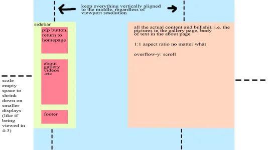
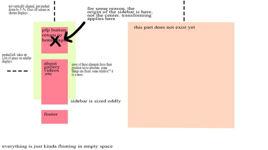
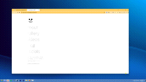
I'm happy to say that I actually do have a little bit of the site working right now! Mostly just everything that's on the left site of the home page.

I'm pleased with the progress I've made so far. I spent a few days learning the raw basics of HTML, and once I figured I knew enough, I got started on this and just googled what I wanted to know as I went along. So this was just made with just plain ol' HTML and CSS. No additional libraries or tools or what have you. And I'm gonna try to aim to make the rest of the site purely HTML and CSS too.
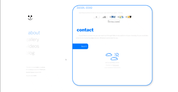
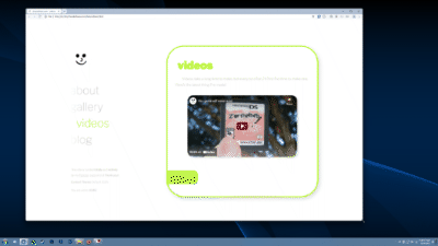
Idk if this GIF really captures it well, but I'm happy with how smooth it is currently. I was worried that animating some of the stuff would make it feel less responsive, but it works great. I'm especially a fan of how the little hole-punch bit with my pfp worked out. Figuring out how to get that shadow to appear was a bit of a puzzle, but I figured it out. That will be the button that returns you to the home page, so I find that it adds a nice little tactile feel.
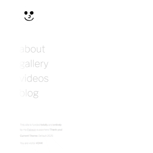
i also begrudgingly coded it so that it looks acceptable on mobile

the future...
I will try to continue to work on this site and provide updates in the future. I will probably be pretty busy in the coming weeks, so idk how much more time I can dedicate. But, I've been having fun working on it. To be honest though, even though I love it, working on illustrations and stuff can be a little taxing and tiring. Especially given my process (doing the boiled-lines stuff and making almost every illustration an animated GIF takes a toll on one's soul). So it's fun to work on something else that has a fun, problem solving element to it that isn't quite as tedious
okay that's it now, thank you reading this very long write up, updates to come later bye bye :))
Last edited:

