tee
Well-known member
- Joined
- Apr 12, 2024
- Messages
- 54
- Reaction score
- 246
- Location
- space
- Website
- t.newgrounds.com
- Gold
- 9,251
- Pronouns
- he/him
hello! not sure if this type of post is fine here, but ive been stuck on this for so long and considering so many of you guys on here are great graphic designers i thought i could ask for some advice because i am losing it at this point
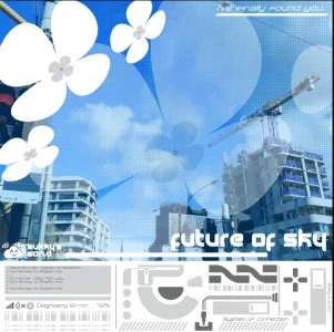
im doing a silly hotel style introductory brochure akin to the one in Flower, Sun and Rain for my discord server for fun, but i've been stuck on the cover for quite awhile now

i think the drawing and the little text in the cloud is neat, but otherwise the cover is pretty empty and i have *no* idea what to do for it. i am willing to hear any recommendations!!
edit: the image above is fullscale (a5), i am specifically asking on what to put under the drawing, sorry for the confusion!
im doing a silly hotel style introductory brochure akin to the one in Flower, Sun and Rain for my discord server for fun, but i've been stuck on the cover for quite awhile now

i think the drawing and the little text in the cloud is neat, but otherwise the cover is pretty empty and i have *no* idea what to do for it. i am willing to hear any recommendations!!
edit: the image above is fullscale (a5), i am specifically asking on what to put under the drawing, sorry for the confusion!
Last edited:

