
- Joined
- Jul 24, 2023
- Messages
- 943
- Reaction score
- 3,708
- Location
- The Cyberworks
- Website
- desktopgeneration.com
- Gold
- 1,371,612


- Pronouns
- he/him
Apple's version numbers aren't synced up, so what the hell. Here's a thread about all of them for this year. That includes macOS Sequoia, iOS 18, iPadOS 18, tvOS 18, watchOS 11, visionOS 2, and whatever the hell they say is on the HomePod anymore.
I updated my desktop / watch / phone / iPad and my initial impressions are that this feels like the most who-still-cares Apple update cycle in the whole time that I have cared. I'm not sure that there's any world left for Apple to conquer and I remain entirely uninterested by (and at times, detest) their "AI" features. As I sit here using my Mac, the only thing different between yesterday & today is that now I can seamlessly mirror over my iPhone & have fully synced mobile notifications. That is really cool.
As for the rest? Not a whole lot that's interesting or worth mentioning. macOS has Windows style window snapping now, which is a feature I once thought I could not live without & have since conditioned myself to living without it. It's undeniably a good feature and fixes my macOS windowing problems but they very rarely rear their heads in the first place. (DISCLAIMER: MY MONITOR IS HUGE)
On iPhone the biggest change is probably that you can darken your home screen icons (and tint them, too!).
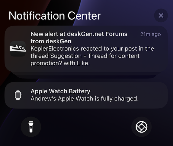
Bizarrely, it generated a fantastic dark icon for deskGen that only shows up in the notifications & not on my actual homescreen. I don't get it either.
The rest of iOS's changes this go around seem to be about adding more user customization at any cost. You can swap out what the buttons on the lock screen do! (Yay!) You can customize the layout of the control center entirely (Yay!) The control center has way too much going on at any point in time because there's way too many buttons now! (Ya- oh.
It's a solidly 6/10 update where for every step forward there's an equal step back in another area, mostly born from this new maximalist elements-everywhere philosophy Apple seems to have gotten into. This is most obvious when you open the new photos app for the first time and think "my eyes are exploding from complete element overload". I felt that a similar feeling when I opened the new control center for the first time.
tvOS... is the same. Aside from getting a new control center last year, it's the same as it has been the near half-decade I've owned an Apple TV. Truthfully, I hope it never changes. It's like the photos app was up until this very moment: well designed to a point that changes aren't necessary.
But hey, at least we can light the Amazon on fire for some genAI features later this Fall.
-----
Anyways, feel free to put anything specifically about this swath of *OS releases here. It's perfectly fine to be less of a doomer than I am, believe me.
I updated my desktop / watch / phone / iPad and my initial impressions are that this feels like the most who-still-cares Apple update cycle in the whole time that I have cared. I'm not sure that there's any world left for Apple to conquer and I remain entirely uninterested by (and at times, detest) their "AI" features. As I sit here using my Mac, the only thing different between yesterday & today is that now I can seamlessly mirror over my iPhone & have fully synced mobile notifications. That is really cool.
As for the rest? Not a whole lot that's interesting or worth mentioning. macOS has Windows style window snapping now, which is a feature I once thought I could not live without & have since conditioned myself to living without it. It's undeniably a good feature and fixes my macOS windowing problems but they very rarely rear their heads in the first place. (DISCLAIMER: MY MONITOR IS HUGE)
On iPhone the biggest change is probably that you can darken your home screen icons (and tint them, too!).
Bizarrely, it generated a fantastic dark icon for deskGen that only shows up in the notifications & not on my actual homescreen. I don't get it either.
The rest of iOS's changes this go around seem to be about adding more user customization at any cost. You can swap out what the buttons on the lock screen do! (Yay!) You can customize the layout of the control center entirely (Yay!) The control center has way too much going on at any point in time because there's way too many buttons now! (Ya- oh.
It's a solidly 6/10 update where for every step forward there's an equal step back in another area, mostly born from this new maximalist elements-everywhere philosophy Apple seems to have gotten into. This is most obvious when you open the new photos app for the first time and think "my eyes are exploding from complete element overload". I felt that a similar feeling when I opened the new control center for the first time.
tvOS... is the same. Aside from getting a new control center last year, it's the same as it has been the near half-decade I've owned an Apple TV. Truthfully, I hope it never changes. It's like the photos app was up until this very moment: well designed to a point that changes aren't necessary.
But hey, at least we can light the Amazon on fire for some genAI features later this Fall.
-----
Anyways, feel free to put anything specifically about this swath of *OS releases here. It's perfectly fine to be less of a doomer than I am, believe me.


