Unconventional Metalheart Practices

alanyze

Member
Joined
Dec 22, 2023
Messages
13
Reaction score
45
Age
18
Gold
1,498
Pronouns
any
I just finished a metalheart piece. I'm a bit proud of it, look:
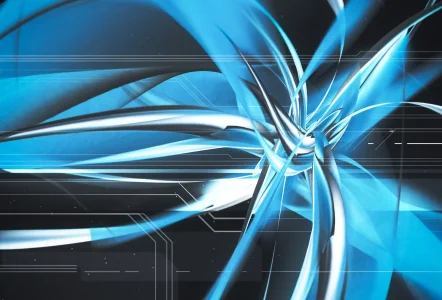
2024 12 6 1913 blue lq.jpgisn't it nice ....
Taking a closer look at a higher resolution, you might notice some strange kind of artifacting.
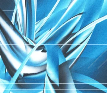
Screenshot 2024-12-06 212733.jpg
This is because what you're looking at is by no means a 3d render-- it's a picture i took on my phone ! :3
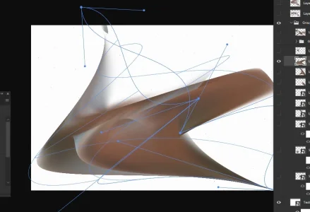
a little more than half a year ago, i was in class and discovered that you don't actually need any kind of 3d software to make it look like something is actually 3d. using photoshop's Warp option in the transform menu, you can mess with anything until it looks nice and abstract, and in some cases, even 3-dimensional. kind of.Screenshot 2024-12-06 213636.jpgScreenshot 2024-12-06 215844.jpg
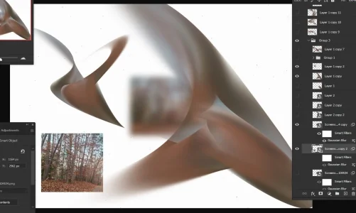
it's definitely easier to get a kind of metallic look if your image is, like, decently blurry. any sharp edges (whether it be the colors of the image itself, or the edges of the image) will lead to that artifacting you saw before. as you could probably tell, it doesn't need to be a specific type of image. anything with a few colors and a bit of depth works, especially if you're gonna make it blurry as hell.
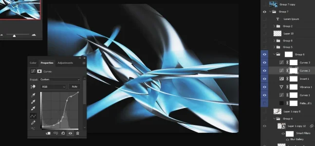
Screenshot 2024-12-06 213812.jpg
all you really need here is patience, a computer good enough to handle it, and a little bit of an artistic vision. I always found it pretty annoying to have to make a model, then wait for it to render, then bring it into photoshop. It's quite satisfying to be able to cut an entire software out of my workflow-- especially when using said software starts to feel monotonous and repetitive. That's not to say I'll never use Blender again, but it's cool that I don't have to.
I think it's pretty funny that it's possible to take the 3d out of abstract 3d art.
if you have any other weird methods of metalheart creation, please share them !! i'm really curious as to how unique your workflows can be.
 
And what sort of gradient maps do you use for the texture look
typically a normal black - neutral - white gradient map, but sometimes other specific adjustment layers work really well. especially Curves. curves is so incredibly useful for everything
 
you are a genius. Thank you for making this.
I was familiar with taking photos and distorting them to make some cool abstract stuff beforehand, but not to this degree , that is so clever!!!

As for me, I'm not sure how "unconventional" my process is, but here goes...
GMDdpomWsAAyse2.jpeg
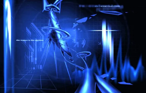
None of this is 3D, either! I painted this in CSP, using airbrushes and whatnot. It's very clear in some points (the jank arises), but less clear in others. It was tedious, but I think it ended up looking pretty nice.
Right after the general ambiance and base color, the strange Shape is usually what gets made first. I start off by making a solid color base, then the secondary color (if necessary), and add more flats accordingly. I then make a few clip layers (in this case, I subdivided each little "section" (the pipes, the donut, the monolith etc) and gave them clip layers where I added shading. It looks much less abstract and more blocky than I'd like it to, but I usually counteract it with a bunch of cool-looking effects, filters with random blending modes and copy+pasted collage-looking stuff (the last few of which I did not do on this piece). The more, the merrier.

image-160.pngScreenshot_2024-12-08-03-03-23-417_com.discord.png

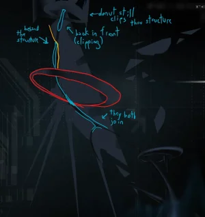
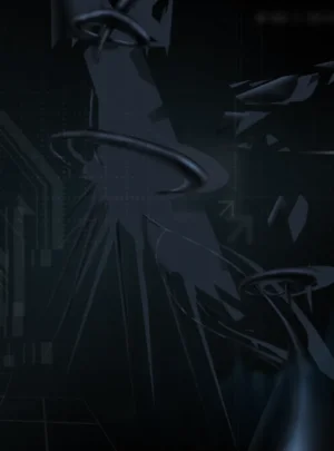
some WIP sketches, i apologize if it's hard to see, the piece was originally much darker because of my monitor settings...

This one's a bit more obvious and janky (I used about three or four layers for the Shape, which is far less going from the 14 of the previous piece), I honestly just wanted to see how little time it would take to make one of these and have it look decent. UI (?) elements were made with square and line tools (I will never learn to work a vector program), by then I was much more familiar with the Fucking Around aspect

e41a4dae-180e-47b6-8a74-5c694ac09701.jpg
That does leave me wondering... Would this be considered vectorheart if no vector programs were used in the process? Rasterheart...?

I think 2D metalheart is fascinating both in concept and in practice and I'm so so glad people are using these clever methods to make some impressive looking art. Your execution is flawless!!! Awesome stuff!! Hugely inspired!!
 
Last edited:
Your execution is flawless!!! Awesome stuff!! Hugely inspired!!
aasjhfsdjgjdsgkjg thank you!!!!!! i've also tried using a more direct approach to painting metalheart in the past. it doesn't have quite the same metalheart look. it would be nice to try it again soon, though .. it was quite fun. maybe i wont fuck the lighting up next time x)
1 8 2024 0704 nbam lq.jpg
 
if you have any other weird methods of metalheart creation, please share them !! i'm really curious as to how unique your workflows can be.
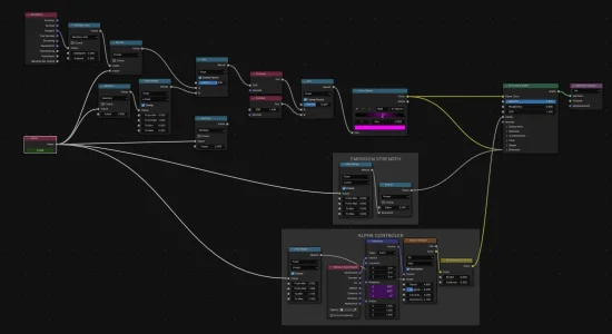
I’ll leave you with my recent Blender shader nodes, using Cycles.

The core of any Bennett Material is typically that my color sources will be a colorramp with a fresnel plugged into it for the factor. Then, in turn I’ll cover the value of the fresnel itself with geometry info - you can get some great messed up values here. Random Per Island is especially good at that.

Anymore I’ve also been doing mixed shaders and plugging that same fresnel that I’m using for colorramp factor into the factor on the mix shader node. Doing that to get the same values that would be white to turn into glass can come out incredibly incredibly cool looking. Would recommend.
 
That is genius. I wonder if people figured this out back in the 2000s. It gives it a special quality imo.


I don't know if it's unconventional per se but I love messing with complex shaders. If you think about them as a 2d photoshop document for example you can apply the same processes of layer blending and masking, brightness / constrast / saturation. plugging a noise node into the mix shader node can create really cool patterns and effects like Andrew's shaders. I've messed a few times with making more distinct glass shaders by combining multiple glass shaders with different colors and different IOR (index of refraction), plugging a noise node into the IOR input to give it a wavy texture. It looks like light splitting and can give that chromatic abberation effect.

I'm making marbles basically

Untitled-1.jpg


a funny thing about Cycles is that because its a path tracer if the color value of a pixel goes above max it actually starts emitting light so you can use these techniques to add glowy bits. That how I did the shader below. I blended two voronoi noise textures to get that bismuth-esque pattern then sent it to both the displacement map and a color ramp so I could set the color value of a small range to something like 400, 255, 0 or just something like that

dispboard.jpg
 
Back
Top