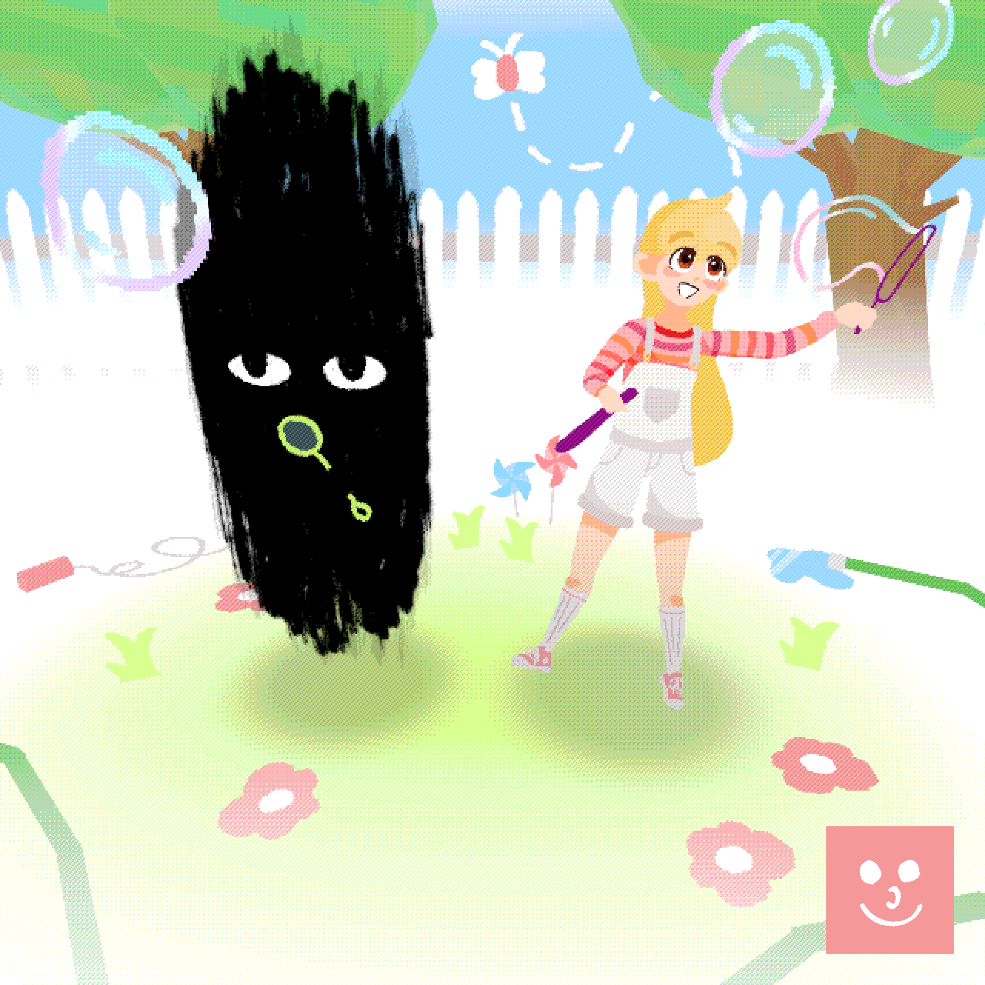
☀️ 10 Years Later (2026) ☀️
HELLO!!!
Another year, another refresh on this piece.
About every year, I revisit and remake this piece featuring the 10 Years Later design of z&c. The previous version I made was last year in February, and
I had made a post in this thread talking about that one and all the previous revisions of this piece at the time, dating back to 2021. On sites like Art Fight (and other places), I do this reoccurring redrawing so that the first time you see this iteration of their design, I'm ensuring that it's in a style that feels current and up to date with where I'm at skill-wise and aesthetically. And to show any design changes on z&c themselves. Also, it's been a fun way for me personally to look back on how I've improved and changed.
Looking back at the 2025 version of this using my 2026 brain, I figured it was definitely time for an update. That one was finished in 2025, but I have project files dating back to 2024, which makes sense. Looking at it, I can see a lot of 2024 chunkofwax-isms in it. Shit that I used to do back then that feels stuck halfway between my 2023 style and 2025 style. A strong usage of texture overlays and an abuse of layers with a bunch blending modes and whatever. But also, more saturated and lineless. There's a lot of awkwardness in it, but markedly an improvement over previous iterations. More confident and skilled, for sure, but I can see myself still trying to find my footing as I experiment with stuff.
And now we're here, just a little over a year later. Definitely an improvement! Every iteration, from 2021 to '23, '25, and now 2026, you can see the differences. I'm always going to be learning new things, so I sincerely doubt that this 2026 version will be the last. But after a few years of consistent, linear improvement, I feel as though a lot of changes will be smaller, more granular things from here on out. With z&c, I feel as though I've started to hit my stride and found a way to present them that feels right. This year marks 5 years of z&c, after all. It's been long enough now to where I think I've figured them out aesthetically and gathered enough confidence to know what does and doesn't work. Creative choices in previous drawings were made in confidence, but I was also just throwing shit at the wall to see what I liked. That's still happening here, but this one also came together pretty fast. I'm still throwing shit at the wall but now it's just shit that I know is sticky.
Awesome analogy.
Anyways.
It's just little things. In the 2025 drawing, the z&c logo was fun, but aesthetically it's something totally different lmao. The background features a photograph of the sky and power lines, a visual motif that was still new to their art at the time. Claire's posing and the composition? Meant to invoke the 2021 art, a hard correction from my 2023 bullshit. Highlight on Z'orthelheb's pupil? Something I've always gone back and forth on. Halftones, torn paper and dust textures? An experiment in seeing how a more textured, grungy style might fit the 10 Years Later aesthetic and differentiate it from younger art of them. Lots of little experiments here and there as I try to make something cohesive.
Now? There's still a lot of experimentation, but I think it's done with more confidence. A lot of the design choices in the background (the pink circles, blue sky) are stuff I've already experimented with in other projects. Like the UI of Keep In Touch from last year, small stuff that I won't finish or have yet to finish, and the hopefully soon-to-be z&c.com (shhhh!!! 🤫🤫🤫). I used the same font on the left as is used in chunkofwax.com. There's some white, low opacity circles floating around in the background... I like the way those looked in
i <3 my computer, so I threw them in here lmao. Previously, I've felt the need to reinvent shit whenever I'd revisit this piece. Not so much anymore.
And in Claire and Z'orthelheb themselves too! Z'orthelheb's neck/tail/appendage takes on a wispier shape, compared to the stiffness of previous art. This is something someone did in an art fight attack of them and I liked it, so I first gave it a shot in
cold front. Claire has her new freckles and a much tighter, cleaner color palette. Posing is just better too. Everything has just come a really long way since the first time I drew them in 2021.
Overall, I'm happy with this. I'm glad it came together relatively fast for me, and I'm glad with where these characters are at right now. A lot of it serves as a reminder to me that maybe I should start to tip my toes into other stuff and really get start making crazy stuff now that I've grown more confident... but idk, I'll get there soon enough.
I had a lot to say this time lol. Might retool some of this and make a blog post out of it.... i never use my blog...
Thank you for reading :)