Z'orthelheb & Claire : 10 Years Later (2025)
and a quick history lesson on z&c...
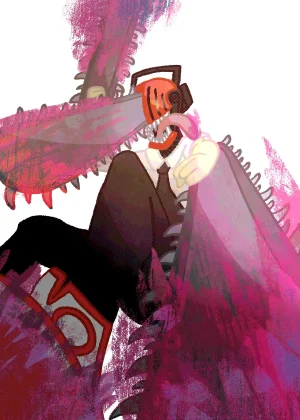
 Here's the drawing....
In most of the art of z&c that I share in this thread, most of the time you're seeing Z'orthelheb and Claire's designs from when they're much younger. When I first made these characters, that's the design I first made. But some time around 2022, I made designs of what they'd look like if they were older, mostly just for funsies.
In a lot of ways, this "10 Years Later" iteration of their characters was my first time really exploring what I could be doing with these characters, both in terms of story and theme. Without divulging too many details.... even if it isn't totally obvious from the outside considering I haven't really had many opportunities to communicate this, anything z&c-related that I make is always made through the lens of my own experiences, especially my own experiences with childhood and growing-up. There's a lot of me in both of these dorks, and I've put a lot of thought in their story! Even if I haven't shared much about their story (in due time lol).
So, considering that, how I portray their aged-up designs, from both a character and thematic perspective, is really important to me! I don't always have the chance to dedicate myself to long-term projects that give you a lot of insight into Z'orthelheb and Claire as characters and the world they live in, so I have to try my best to do that through visuals alone! Like in this drawing I'm sharing rn
Every other year, I usually re-do the "key art" (so to speak) of this design so that I can accurately represent whatever new perspective I've gained, and any new art style developments. The latter tends to happen often lol
So lets go through some of that older art!
2022
 Here's my old, old artstyle. lol.
Z&C were first created in July 2021 (fun fact: originally made as characters for Art Fight) This drawing was made around late 2021, early 2022? This one went under a few reiterations, for some reason. Around this time was when I was experimenting with digital water coloring. Very short-lived period though. A lot of my art back then had this very messy, playful quality to it, which I think has its own charm that I'm still fond of. I like to think I still retain that quality in my art, with much more polish though. This was back when I was dicking around just purely for the fun of it :)
2023

I have really mixed feelings about this one!!!
For a long while, esp during 2023, I had a really hard time finding a way to draw this version of Claire in a way that I was happy with. This drawing initially started as a little experimentation with drawing more detailed human faces, and accidentally resulted in being that drawing I'd use to replace the 2022 one on their art fight page and stuff. I was happy with it then, but I just feel really iffy about it now. It's nice, cause this was when I was starting to find my footing with how I wanted to communicate the overall "vibe" with these two, and how I'd want to differentiate the vibe between "10 Years Later" and the typical z&c art. But ultimately, this is just not at all indicative of my actual art style. During 2023, I was feeling really ambitious. And even though I was creating a lot more stuff during this time and also creating some of my most technically impressive work, I was also a little lost creatively imo.
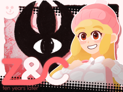
2025

And now to the present day.
While working on this, I wrestled with myself for a while, cause I think I wanted to do
too much with this piece at first. I was playing around with a bunch of different ideas. But I just settled on this, which I honestly think is for the best. I decided that I didn't want to stray too much from my original intention of this drawing, and that was just to create something that, even if not very exciting, felt reminiscent of previous pieces while still updated to feel relevant. And I think I did that well! And even still, I'm happy with some of the design elements and choices that I made here that I probably wouldn't have made in the past, like in the background. Z&C design language has always been really, really heavy on white and pink color schemes. An intentional choice to make Z'orthelheb stand out and reflect Claire's personality. But I'm happy with the black halftone patterns here, it fits in nicely. And designing the "Z&C" text in the bottom left was fun too. There's enough here to make it feel fresh, but it also feels like a return to form for me in a few ways, which is nice. Overall, I'm satisfied :)
Anyways, that is the end of my little history lesson. If you actually read all of this, thank you lol. I know that none of you people here in the wonderful world of dG dot net have the same connection to these characters that I do, obviously. But humoring me and reading my ramblings is nonetheless very, very appreciated.
that's the end of this post now........ there's some real life stuff that I gotta take care of now........ thank you for gifting me your

s...... im excited to see the results of the blurb style competition.......... hopefully in the near future i can dedicate more time to my cool little secret project that im also working on rn......... z&c type shit.... keep your eyes peeled in this thread...... okay now bye bye